
The Visual Editor in the WhatCounts Platform enables marketers to focus more on content and less on writing, maintaining, and fixing HTML.
Visual Editor
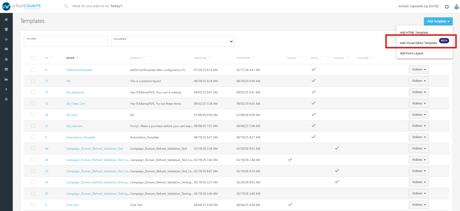
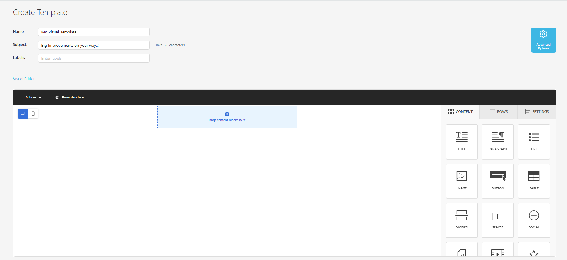
The templates created with the Visual Editor are responsive by default and should render correctly in all popular email clients. The first step in creating a new template is to click on “Add Visual Editor Template”.
Then, the editor will load, and enter the
-
Template name,
-
Subject line, and
-
Label. [Optional]
Templates in the Visual Editor are built using Rows, and Content is added to those rows to create the email.
Rows
Rows are used to define the general structure of your email, help break up the template, and enhance the flexibility of settings that need to be set for specific parts of the email.
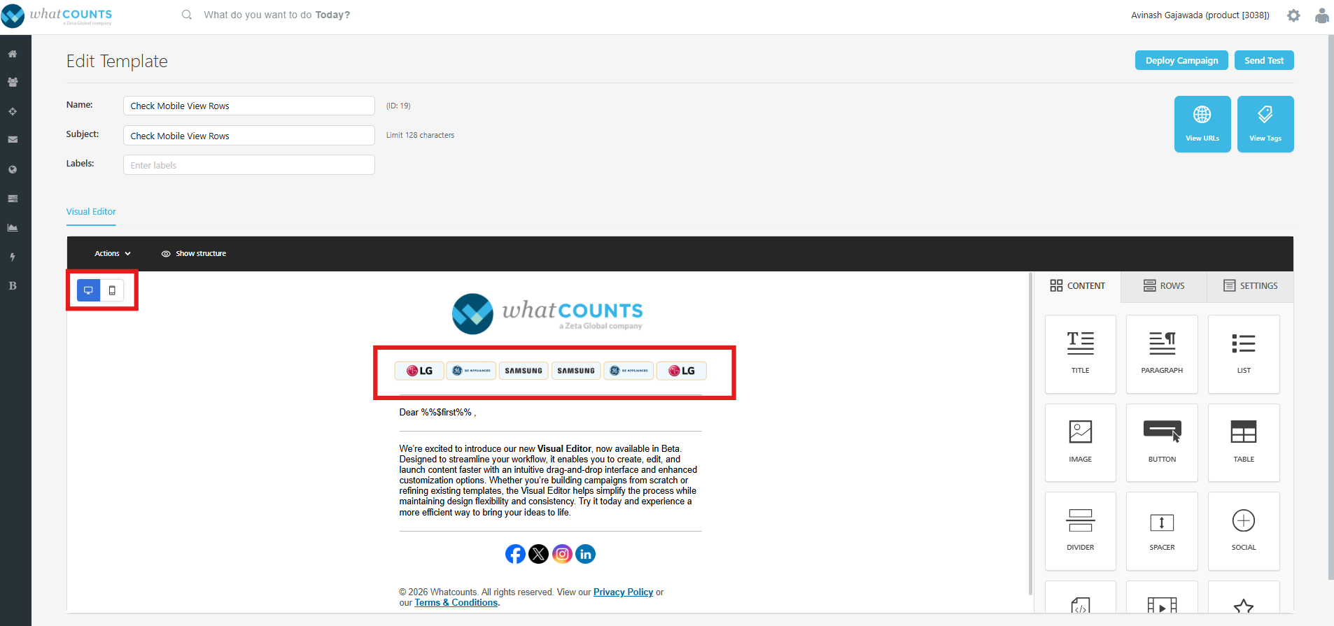
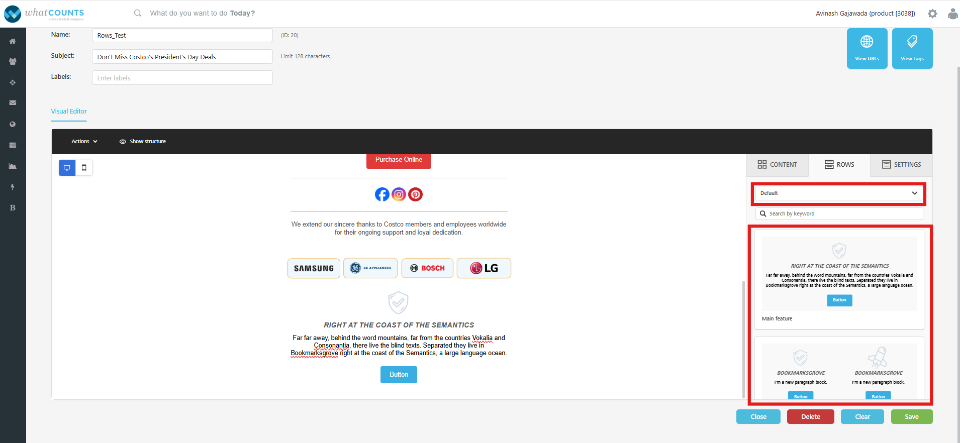
Rows allow up to six columns of content, and in mobile view, columns automatically stack with the left column displayed first, followed by the right, as shown in the screenshots below.
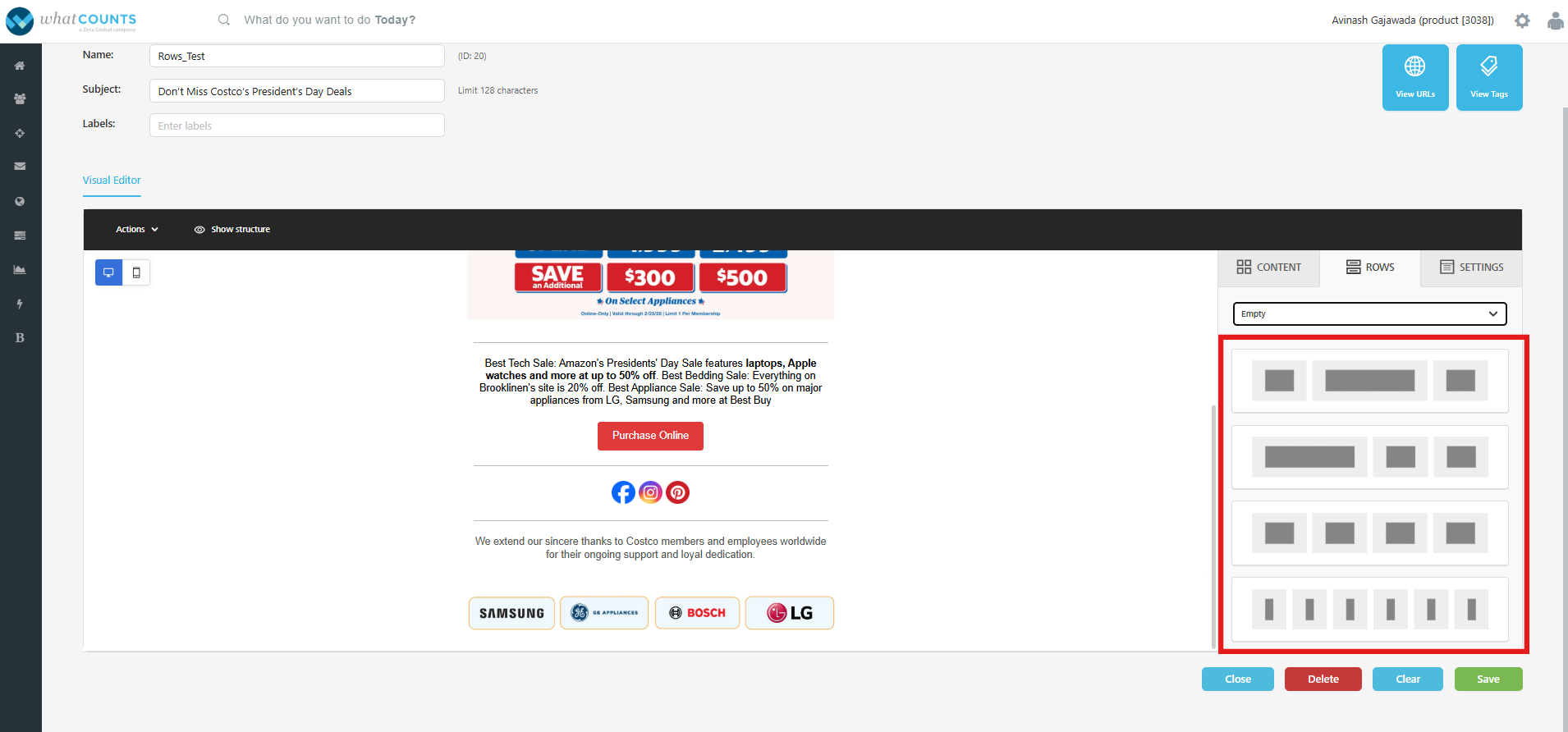
Stacking can optionally be disabled, but this may lead to undesirable rendering. Additional columns can be added from the row settings.
Column properties are also available here. These options can be used to adjust background colors for specific rows, add or remove padding, and adjust borders. Once the overall structure of the template is configured using rows, it's time to start working on content.
You can switch to “default” rows and use the pre-defined template formats to start working on.
Content
To add a content block to your email, click and drag it into the appropriate row. To see further options for the content block, click on the block in the email template.
|
Content Type |
Description |
|---|---|
|
Title |
This content block is used to define the primary headline of the campaign. It serves as the main identifier of the content and is typically displayed prominently at the top of the layout. This content type allows users to:
|
|
Paragraph |
This content block is used to add and manage the main body text within a campaign. It allows to input detailed information with the option to configure the list styling such as font style, size, alignment, spacing, and indentation. This content block is ideal for descriptive text, explanations, promotional copy, or supporting information beneath headings.
|
|
List |
This content block is used to add text in a list format with the option to configure the list styling.
|
|
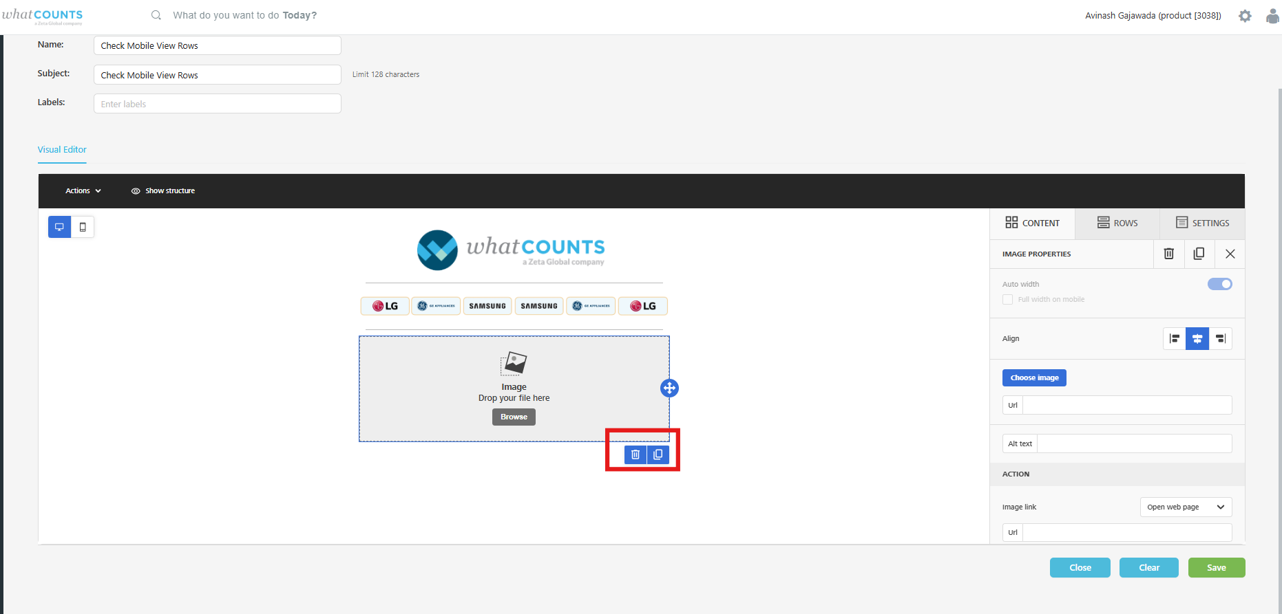
Image |
The image content block is used to add images to a template. Upload an image by clicking and dragging it onto the grey placeholder or by clicking browse. Clicking browse will open the image library for the visual editor. The image library allows images to be:
Simply click Insert next to the image you want to add to the template. To close the image library, click the round X icon in the top right of the UI. After an image is added, additional options for the image content can be seen by clicking on the image. These options are where the width can be adjusted and links can be added. |
|
Button |
The button content block is used to add a CTA to a template. |
|
Table |
The table content block is used to add support for data tables. This is limited to text only. |
|
Divider |
The divider content block is used to add a divider or negative space to content in a controlled manner. The line can be:
|
|
Spacer |
The spacer block is used to add space between blocks. |
|
Social |
|
|
HTML |
The HTML content block is used to add any custom content to a template. |
|
Icons |
This content block allow visually enhance emails by adding small graphical elements that represent actions, social media platforms, contact details, or key highlights. This provides a customizable icon block where users can adjust size, spacing, alignment, and color to match brand guidelines. This feature is particularly useful for adding social media links, bullet-style feature points, or interactive elements while maintaining a clean, responsive design across devices and email clients. |
|
Menu |
The menu block is used to add a simple, text-based navigation element. Clicking on a menu block would show more options to configure the menu items and click actions. |
|
Text |
The text content block is used to add copy to the email.
|
|
Video |
Videos are not directly embedded in email as a best practice, but this block still provides intuitive user experiences to nudge readers toward clicks.
|
Duplicate and Delete Content/Row:
Select the content/Row that you want to delete from the template. You’ll see a delete icon. click to see a confirmation pop-up, and then click “Delete” to delete the content/row.
Click the “Duplicate” icon to duplicate the content/row.
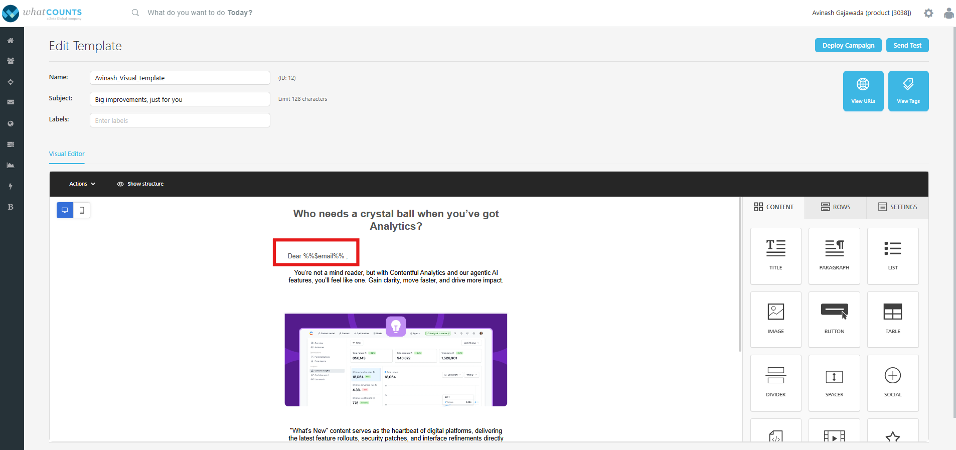
Merge Tags
Personalize your content with merge tags, which are dynamic pieces of WhatCounts Markup Language code that can be inserted codelessly. In the text-based content blocks, select Merge Tag from the in-line editor to open a list of user properties of the realm.
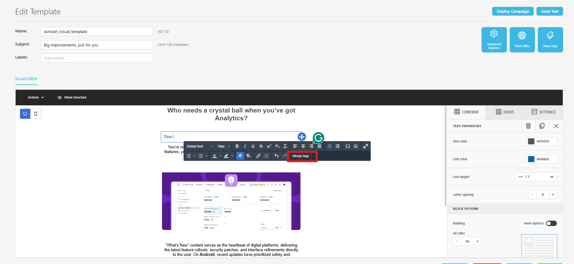
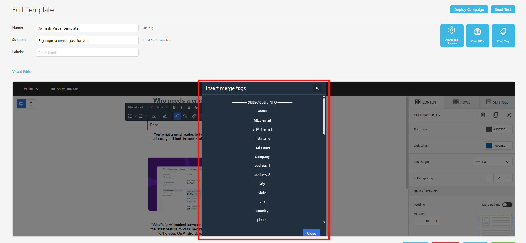
Scroll to see more available tags. Click on it, to insert. Once inserted, a tag will appear to give you a clear picture of how the merge tag will look. These tags dynamically expand during deployment, utilizing the respective values associated with each user.
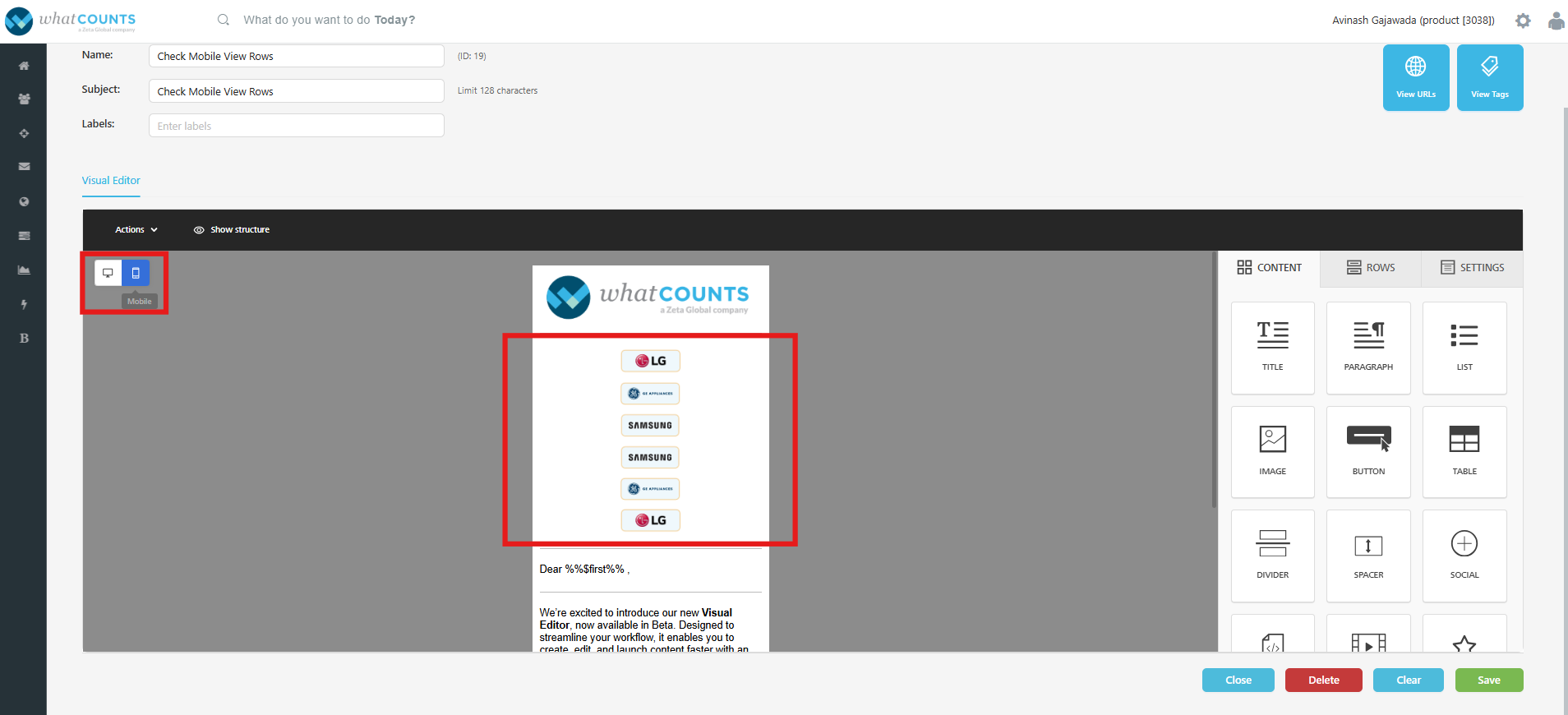
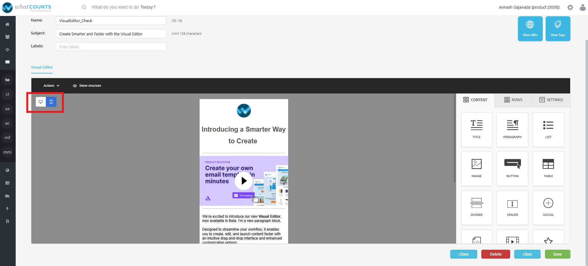
Mobile Design Mode
By default, the Visual Editor is launched on the desktop editing view. Click on the Mobile icon in the top-left area to switch to mobile view. You can continue to edit your content while in mobile design mode.
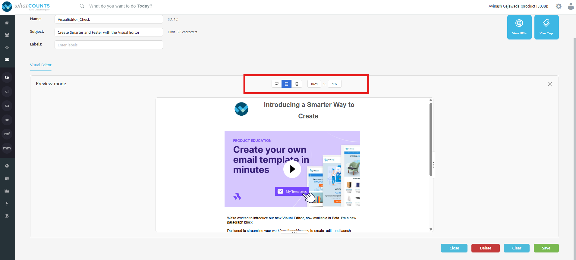
Actions → Preview:
Click this to view the campaign in multiple customizable devices. For quick view, you’ll see Desktop, Mobile, and Tablet. To close the preview, click the X icon in the top right of the UI.
-
Click “View URLs” to view the list of URLs used in the template.
-
Click “View Tags” to view a list of tags used in the template.
-
Click “Close” to close the template editor.
-
Click “Delete” to delete the template.
-
Click “Clear” to clear the content/rows from the template.
-
Click “Save” to save the template.
-
Once you save the template, you can perform test or deploy a campaign.